Numbers about the coronavirus crisis have been repeated so often that they have become numbing. Daily reports about additional new infections, hospitalizations, and deaths are real—and important. But now we have vaccines that can effectively protect those who get their shots from infections. This provides grounds for hope that in the foreseeable future we will see a return to life more like we knew it before this deadly virus arrived.
Public health 101 reminds us: vaccines don’t save lives; only vaccinations do. The question most citizens are now asking is when they and their loved ones can get their shots.
State governments provide regular updates relevant to this question. Their health departments’ websites issue weekly releases about COVID guidance and data, while governors and their teams reassure the press daily with briefings about initiatives they are taking. But since the purpose of these is not only to inform citizens, but also to accentuate the positives about what they have been doing, these mostly focus on efforts—not results.
Fortunately, at the federal level, the CDC is collecting data from each of the 50 states daily and posting it expeditiously on its user-friendly website. The site provides summaries of this data on a state-by-state basis, making it possible to compare the performance of the state in which you are living with all 49 others. Using this data, it is fairly straightforward to grade each state. And since the implications of higher rather than lower grades are lives saved, or for lower performers, deaths of citizens that could have been prevented, these grade matter. Each of us can even calculate how soon we personally are to receive our vaccination if we live in another state rather than the one we live in now.
This brief report offers a citizen’s guide to grading your own state’s performance—or calculating you and your family’s chances of being vaccinated in the near future. It identifies key sources and provides a checklist that citizens across this great country will use to hold their own governors and state governments accountable in order to spur them to run faster than they are now doing in order to prevent more unnecessary deaths.
Note: The Boston Globe is already using this checklist to develop an adapted version of the Report Card published on its homepage. With support from the Belfer Center, the Globe editorial board will provide a weekly updated Report Card on Massachusetts’ vaccination progress and rankings relative to the other states.
-
Background
In the race to develop and approve coronavirus vaccines, the U.S. has made significant improvements over its abysmal failures in testing and pandemic management. The Trump Administration’s Operation Warp Speed produced nothing short of a miracle in shrinking the timeline required to create an effective vaccine. What had normally taken a decade was done in less than 12 months. Two coronavirus vaccines from Moderna and Pfizer/BioNTech have been approved for use with a third from J&J likely to be approved by March. But having an FDA certified vaccine is only the first step in getting shots into people’s arms. To repeat: vaccines don’t save people; only vaccinations do.
Moderna and Pfizer will each deliver 100 million doses of vaccine by the end of March and a further 200 million doses by the end of July. The federal government distributes these doses of vaccines to states on a per-capita basis. So far this has meant delivery of about 25 doses for every 100 eligible residents. While some state governments have attempted to deflect blame by pointing to deliveries as the bottleneck in vaccinating citizens, we give the federal government an “A” for this part of their job, since the U.S. ranks at the top of the international competition in numbers of effective vaccine doses available.
After vaccines are delivered to the states, governors, their state governments, and the healthcare providers whom their state governments regulate are then responsible for the “last mile challenge”: getting doses of the vaccines off shelves in refrigerated facilities into their citizens’ arms. Since the number of doses each has is proportional to its population, all states start the race to vaccinate their residents on a level playing field.
-
Key Questions
As citizens consider this 50-state vaccination race and the risks COVID presents to us and our loved ones, three questions stand out: How likely am I or one of my loved ones to die from coronavirus? How soon are we likely to get vaccinations to protect us from this scourge? And how long it will be before the rest of our fellow citizens are all vaccinated and return to something like life as it was before the disruption? The answer to each is: it depends. Of course it depends on the rate at which vaccines are delivered to the states and the criteria for eligibility.
But to an extent that will surprise most readers, it also depends on where one lives. The fact that nearly two Alaskans have been vaccinated for every one in the Sunflower State should provoke concern and curiosity—not just from residents of Kansas but of all 50 states as to how their state governments are performing in the race to administer vaccines, save lives, and recover to a new normal.
The CDC, Bloomberg, and many other sources like the Covid Tracking Project provide data on many aspects of this challenge. But the bottom lines of most interest to most of us assess how each state is doing on four key performance indicators: number of people killed by coronavirus per capita; number of people vaccinated per capita; vaccines in arms as a percentage of doses delivered to the state; and months required to vaccinate all those eligible. By ranking the states on each metric, we can create Vaccine Report Cards that separate the A’s and B’s from the D’s and F’s. Particularly for those now earning failing grades, publicizing their Report Cards will doubtless get their governors’ attention—and hopefully encourage them to deliver better performance. With our Report Cards we can watch the race weekly and track our states’ progress—or lack thereof.
-
Reading the Report Card
Our purpose in creating the Report Card is to translate the array of statistics available about states’ performance into an easy-to-read summary that communicates the brutal bottom lines in ways that will promote accountability. The metrics are:
- Deaths Per Capita: the total number of deaths caused by COVID-19 as a proportion of the state’s total population.
- Vaccinations Per Capita: the total number of people who have received at least one dose of the vaccine as a proportion of the state’s population. The CDC reports this metric using the state’s total population. An alternative (and we think more accurate) approach is using the 18+ population, since the available vaccines have minimum age requirements (minimum 18 years old for Moderna and 16 years old for Pfizer).
- Vaccinations as a Percentage of Doses Available: the number of vaccine doses actually used to vaccinate individuals as a proportion of the number of doses delivered by the federal government to the state.
- Months to Finish Vaccinating Eligibles: assuming the state continues at the current rate, an estimate of the time required to vaccinate the entire eligible population.
-
How to Create Your State’s Vaccine Report Card
The data used to create the Report Card comes directly from the CDC COVID Tracking website, which collects daily reports from each state and thus makes it possible to compare their performance “apples to apples.” At the basic level, one can compare one’s own state with others by simply going to the CDC Data Tracker; clicking the option labeled “Vaccinations in the US”; scrolling down to the U.S. map; and clicking on your state. For example, clicking on Rhode Island, one will see that in doses administered per 100,000 citizens, it is running behind the numbers in the Report Card included here on the state in which we live, Massachusetts. Citizens with a working knowledge of Excel can create a full Report Card like the one we did for Massachusetts in nine easy steps*:
- Create a new Excel spreadsheet with five columns: “State Name”, “Deaths Per Capita”, “Vaccinations Per Capita”, “Vaccinations as % of Doses Available”, and “Months to Finish Vaccinating Eligibles”. This will be your primary spreadsheet. In the column “State Name”, list all 50 states alphabetically (you can also copy the list here). For a refresher on how to use the Excel functions needed, see Excel Easy’s tutorial. Make sure to use the “paste values” function when pasting data (accessed by right-clicking, selecting “Paste Special,” and clicking “Values”).
-
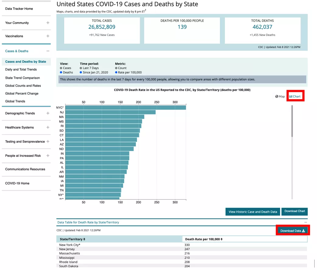
Deaths Per Capita: This metric is directly available at the CDC Data Tracker’s “Cases and Deaths by State”. Scroll down until you see the U.S. map and click “Chart” on the right. The map should change to a bar graph showing state deaths per capita. Scroll down and click “Data Table for Death Rate by State/Territory”; and then click “Download Data”. Open the downloaded spreadsheet, alphabetize the spreadsheet using Excel’s sort function on the states column, and delete all non-state rows (i.e. American Samoa, District of Colombia, Federated States of Micronesia, Guam, New York City, Palau, Puerto Rico, Republic of Marshall Islands, United States of America, Virgin Islands, Northern Mariana Islands). Then copy the column “Death Rate per 100000” into your primary spreadsheet’s column “Deaths Per Capita”.
-
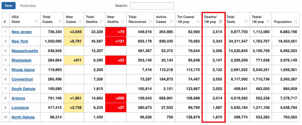
Deaths Per Capita Adjustment: One minor adjustment needs to be made to the data collected in Step 2. Go to Worldometers, scroll down to the table, and click the column “Deaths/1M pop” to rank the states. New York should be ranked among the top five. Get the number listed for New York, divide it by 10, and use it to replace New York state’s “Deaths Per Capita” value in your primary spreadsheet. In the example below, New York's Death/1M pop is 2,343, which means in your primary spreadsheet you would put 234.3 for New York in your “Deaths Per Capita” column. This step is necessary to ensure that all states are being compared “apples to apples” no matter which state you are creating a Report Card for**.
-
Download CDC Vaccinations Spreadsheet: Go to the CDC Vaccine Tracker; scroll down past the U.S. map and click “Data Table for COVID-19 Vaccinations in the United States”; and then click “Download Data.” Open the downloaded spreadsheet (which will be referred to as the CDC Vaccinations spreadsheet) for use in Steps 5 - 8.
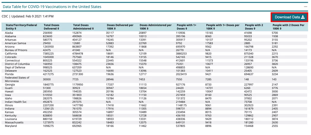
- Organize Spreadsheet: Alphabetize the CDC Vaccinations spreadsheet using Excel’s sort function on the states column and delete all non-state rows in the spreadsheet.
-
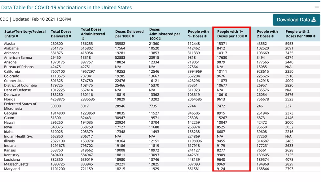
Vaccinations Per Capita: This metric is directly available in the CDC Vaccinations spreadsheet as “People with 1+ Doses per 100K”***. Copy this column into your primary spreadsheet’s column “Vaccinations Per Capita”.
-
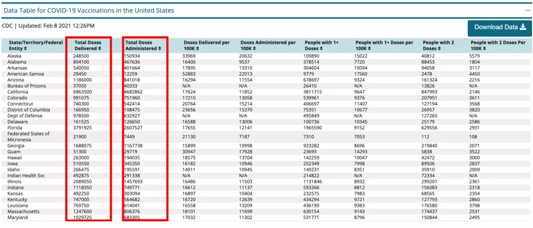
Vaccinations as a Percentage of Doses Available: This metric can be calculated by dividing “Total Administered” by “Total Delivered” in the CDC Vaccinations spreadsheet. Copy the resulting column into your primary spreadsheet’s column “Vaccinations as % of Doses Available”.
-
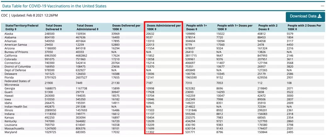
Months to Finish Vaccinating Eligibles: This metric is slightly more complicated. For a handy guide, see Appendix I. Alternatively, a simpler estimate is directly available in the CDC Vaccinations spreadsheet as “Administered per 100K” (which reflects vaccination rates and progress, though not a direct analogue for months required). Copy this column into your primary spreadsheet’s column “Months to Finish Vaccinating Eligibles”.
-
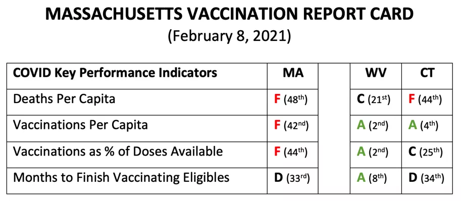
Converting Rankings to Letter Grades: Generate rankings for each metric by using Excel’s sort function on the metric’s column. Sort from smallest to largest for “Deaths Per Capita” and “Months to Finish Vaccinating Eligibles”; and from largest to smallest for “Vaccinations Per Capita” and “Vaccinations as % of Doses Available”. Record the rankings as you sort each metric and assign grades on a curve in which the top 10 are awarded A’s and the bottom 10 F’s
* For a checklist on creating Report Cards, see Appendix II. For ways to access rankings directly without Excel, see Appendix III.
** New York’s overall deaths per-capita is currently 2nd highest and will likely remain so. Using CDC data, the metric can be calculated manually by taking a weighted sum of the New York City and New York State deaths per-capita, represented by the following formula: New York Total = 0.43 * NYC + 0.57 * NYS.
*** The CDC reports vaccinations per capita based on the total population. An alternative (and we think more accurate) approach is using the 18+ population, since the available vaccines have minimum age requirements. This measure can be calculated by dividing “People with 1+ Doses” by each state’s 18+ population (see Appendix I), resulting in slight differences with the CDC’s “People with 1+ Doses per 100K”.
Appendices
Appendix I: Months to Finish Vaccinating Eligibles
Calculating this metric requires two additional spreadsheets using the following steps:
- Download data for state populations aged 18 and above, available at the U.S. Census under “Population Estimates by Age (18+)”. Delete all non-state rows and copy the 18+ population data into a new column in the CDC Vaccinations spreadsheet.
- Download data for daily doses administered by state, available at Our World in Numbers under “Daily COVID-19 vaccine doses administered”. Sort the spreadsheet by date (using Excel’s “Sort Newest to Oldest,” which will also automatically alphabetize the states) and use the data for the most recent date (which should be the first 66 rows). Delete all non-state rows for that date and copy the daily doses administered data into a new column in the CDC Vaccinations spreadsheet.
- Subtract the CDC Vaccinations spreadsheet data “People with 1+ Doses” from the 18+ population (resulting in the number of unvaccinated eligibles).
- Divide that number by the daily doses administered (resulting in the number of days to finish vaccinating eligibles), and then convert to months by dividing by 30.
Note: The resulting number of months is a simplified estimate based on single doses, since the current vaccines provide high levels of protection after a single dose, and J&J’s forthcoming vaccine will be a single-dose vaccine. Moreover, since second doses are administered 3-6 weeks after the first, the relative rankings of states would remain similar even by more complex calculations.
Appendix II: Checklist on Creating Report Cards
The below checklist summarizes the previous steps to create Report Cards. For ways to access rankings directly without Excel, see Appendix III.
- Deaths Per Capita: This metric is directly available at the CDC Data Tracker’s “Cases and Deaths by State”. Download the “Data Table for Death Rate by State/Territory” and find the metric as “Death Rate per 100000”. Adjust New York deaths per capita based on the number at Worldometers.
- Download CDC Vaccinations Spreadsheet: Go to the CDC Vaccine Tracker and download the “Data Table for COVID-19 Vaccinations in the United States” for use in the next steps.
- Vaccinations Per Capita: This metric is directly available in the spreadsheet as “People with 1+ Doses per 100K”. A more accurate measure can be calculated by dividing “People with 1+ Doses” by each state’s 18+ population.
- Vaccinations as Percent of Doses Available: This metric can be calculated by dividing “Total Administered” by “Total Delivered” in the spreadsheet.
- Months to Finish Vaccinating Eligibles: This metric is slightly more complicated. For a handy guide, see Appendix I.
- Converting Rankings to Letter Grades: Remove all non-state rows and generate rankings for each metric using Excel’s sort function. Assign grades on a curve in which the top 10 are awarded A’s and the bottom 10 F’s.
Appendix III: Alternative Data Sources
Other sites organize CDC data in more accessible forms for evaluating some of the key performance indicators without needing to use Excel. These include:
- Bloomberg Vaccine Tracker
- Provides daily statistics for vaccinations, including two of the report card metrics. Bloomberg also gathers data from state government websites, so there may be some differences between the statistics reported here and from the CDC.
- Vaccinations as Percent of Doses Available: This metric is directly available under “Supply used”.
- Vaccinations Per Capita: This metric is directly available under “% of population given 1+ dose”.
- Our World in Numbers
- Provides statistics and visualizations for vaccinations and historical trends, including two of the report card metrics. Historical trends can be viewed using the slider for each visualization.
- Vaccinations as Percent of Doses Available: This metric is directly available under “Share of available COVID-19 vaccine doses that have been used”.
- Vaccinations Per Capita: This metric is directly available under “Share of people that have received at least one dose of COVID-19 vaccine”.
- Worldometers
- Provides daily statistics on cases, deaths, and other metrics.
- This site provides deaths per-capita for all states, including New York overall (bypassing the manual calculation noted above)
Allison, Graham and Hugo Yen. “When Can You be Vaccinated? A Citizen’s Guide to Grading Your State’s Performance.” Belfer Center for Science and International Affairs, Harvard Kennedy School, February 17, 2021


