Trends in poverty and income inequality and the Iran election debate

This is not my first post on poverty and inequality in this blog, but I feel I need to update my previous posts on these topics because so much is said about them by the presidential candidates, and often more confusing than illuminating. Thanks to the availability of surveys of household expenditures and incomes, we know quite a bit about both poverty and income inequality, but everyone who uses these data does not come to the same conclusion. I have read frequently that cash transfers have increased poverty, a claim that challenges common sense and the available evidence.
Two recent papers of mine (this and this) examine the data carefully and come to the conclusion that poverty and inequality, which were on their way down during Ahmadinejad years, have crept back up under Rouhani. This is not to say that economic policy was better under Ahmadinejad, or that the improvements had a lasting effect, but they are the facts we have and cannot be wished away.
The two papers referenced above use the same data and reach very similar conclusions, namely, that poverty rates were falling during the recession years of 2011-13, thanks to cash transfers, and increased in 2014-2015, when energy prices increased while cash transfers were losing their value.
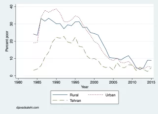
The relevant graph for poverty (Figure 1) depicts the percentage of individuals whose per capita expenditures was below $5 PPP poverty line each year (known as the poverty rate or the headcount ratio). I have adjusted household expenditures for differences in the cost of living between the three regions of Tehran, and other urban and rural areas.

No surprisingly, poverty rates are lower in Tehran than the other two regions. Less obviously, we note that urban and rural areas have similar poverty rates. The more noteworthy message of this graph, which is the subject of the election debates, is the decline in poverty after 2009, first because of oil-induced increase in household consumption, and cash transfers after 2010, when the economy faltered under the weight of the sanctions.
The press reports inside and outside Iran have produced much confusion, using unpublished evidence not subject to peer evaluation. For example, according to Financial Times of October 25, 2013, “During Mr Ahmadi-Nejad’s eight-year tenure, the percentage of Iranian families living under the poverty line increased from 22 per cent to more than 40 per cent, according to [so and so], a prominent economist.” Today’s Christian Science Monitor quoted another prominent Iranian economist with an unequally unfounded claim: “He estimates that Iranians’ purchasing power decreased sharply during Ahmadinejad’s tenure, by perhaps 50 percent to more than 70 percent, as inflation soared to 40 percent and sanctions bit.” To see that such claims are baseless see Figure 3 below. Such exaggerations of the negative impact of Ahmadinejad’s policies on living standards by Rouhani’s supporters is the reason why Rouhani took the poor for granted and is now struggling to win their vote.
I do not know what poverty line the said prominent economist had used to arrive at a poverty rate of 22% in 2005, when Ahmadinejad took office — there is line that yield that number — but no matter which line one uses, one cannot get to a poverty rate of 40% in 2013. The same nonsense was repeated in New York Times (though in a well meaning attempt to argue that sanctions are hurting ordinary Iranians).
As you can see in the graph above, between 2005-2013 the poverty rate was cut by half, first because of rising oil revenues and later because f cash transfers, and this is independent of which poverty line one uses. The only way you can get the result reported in FT and NYT is to use a higher poverty line in 2013 than in 2005. (This is because the distribution of per capita expenditures in 2013 stochastically dominates the distribution for 2013.) In Figure 2, I keep the poverty line fixed for all years at about $5 per person per day and convert household expenditures to constant 2015/16 prices using the Consumer Price Index.
The results clearly show that poverty rose in the two Iranians years 2014/15 and 2015/16 when Rouhani was in office. There are good reasons why this happened. Rouhani raised energy prices, by about 50%, which hurt the poor more than the rich, without compensation. Since cash transfers were losing their value to inflation, poverty increased. Now, Rouhani used the money from higher energy prices to fund an important expansion of health care, but those benefits do not show up in household expenditures and may even lower them.
I believe that Rouhani’s team trapped themselves by saying publicly and repeatedly that cash transfers were unacceptable as economic policy because they “fostered beggars.” I have not seen any evidence of the effects of Iran’s cash transfers on the poor, other than they have lifted many out of poverty. Rouhani’s take on the issue ignores tons of evidence in favor of unconditional cash transfers that has been produced in recent years, and the fact that they are increasing in popularity.
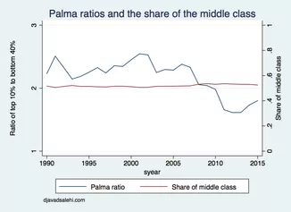
Turning to inequality, there is less room for disagreement because there is no poverty line to move around arbitrarily. My favorite measure of poverty is the Palma Ratio, which I discussed in a previous post. The graph below updates the data from that post to 2015/16.

The logic behind the Palma Ratio (PR) is that in most societies the share of the middle class (deciles 5-9) in total income or expenditures remains fairly constant, and most of the action in inequality comes from changes in the fortunes of the poor (bottom 40%) relative to the rich (top 10%), which is captured by their ratio.
Iranian inequality meets the premise of the PR nicely. The share of the middle-income groups (the red line in Figure 2) is fairly constant at around 50-55% throughout the post-war period. The PR appears to rise when oil prices increase (in 1991, 2000, and 2005), and fall as oil money trickles down to poorer households. Oil money always flows from the top down, no matter who is president, going first to people closest to the power structure and gradually trickling down the income ladder. How fast and how far this reaches depends on government policy — who gets to borrow, where public investment goes, and who gets public transfers. Throughout the Ahmadinejad period (2005-2013), this ratio was falling, and increased during 2013/14-2015/16. What has happened in the year that ended in March, when there was economic growth, we do not know because the micro data for that year is still not out.
The lesson from the Palma Ratios is that when external schools rock the Iranian economy, whether they are from oil prices or sanctions, the main tensions arise between the top and the bottom of the distribution. The middle classes seem protected, at least as far as their share of the pie is concerned.
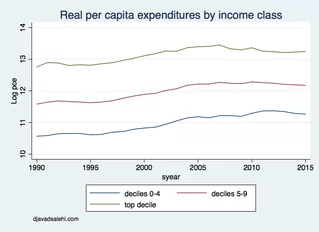
The level of welfare of these income classes has political implications of its own. We have heard that during Ahmadinejad, middle classes suffered. Many are on fixed salaries, which did not keep up with inflation. Figure 3 shows how for the three classes average per capita expenditures have changed since 1990.

The living standards of the top decile and the middle class grew during 1995-2005, roughly the Khatami era, and stopped growing sometime after Ahmadinejad was elected, and even declined after 2010. The poor did slightly better than the other two groups, mostly thanks to redistribution. Is there any surprise that some of them would want someone with his policies back? The key to understanding the allure of populist promises by the conservative candidates is in Figures 2 and 3.
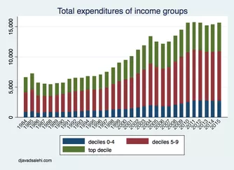
Finally, Figure 4 shows how the total real incomes of the three classes have changed since 1990 (total expenditures in billions of 2015/16 prices, normalized by household size).
Salehi-Isfahani, Djavad. “Tyranny of numbers.” May 17, 2017


